
Starting in the middle
My work involves doing research in atmospheric science. At one end, as input, I consider satellite and ground measurements, model outputs, weather indicators. On the other end, I’m supposed to produce scientific articles that use well-chosen visual representations of some particular subsets of the input data to propose insights into how the world works. What happens in between… is hazy.
It involves iterating a lot on data processing, exploration, and interpretation. It involves following hunches that make you obsess over a sub-sub-sub-sub-part of your input dataset that you absolutely have to understand, changing your analysis approach mid-flight, or confront parts of the data that at the start had little to do with each other. It involves showing your results to other scientists and then try to figure out answers to their questions. Most importantly, it involves plotting a lot of data, and looking in the plots for insights that keep you going, without letting you be overwhelmed by the deluge of evidence.
This middle part of the work is tricky to navigate. At each step you have to decide what you should do next, with little solid ground to stand on, and really no clear idea of where you want to go until quite late. I’ve always had trouble knowing how to proceed. In a very practical way, what do you do? In the past, you could print out all the figures you’ve plotted, spread them all out on a biiiiiiig table, and try to make sense of it all. Nowadays, there are many times more figures, you can’t spend your days printing them all out and spreading them out everywhere.
I had been looking for quite some time now for a software solution that would let me handle the part of the work when nothing is clearly settled, where you’re not even sure what is going on. To handle that, as I see it, an app would need to let me 1) handle mixed media – not only text, not only images, but both, at the same structure level, 2) restructure things quickly without bothering me with high levels of detail or administrative work (like dialogs or menus), and 3) organize things non-linearly. This is a big one, that needs to be unpacked.
Non-linear organization
When I’m amassing evidence for something, often it’s not clear what should be near what, what should be part of which group, what should go before what or after what. Creating these connections in a given context is thinking. Any app that forces me to decide where something should go right away, before I had time to consider which elements are present, and digest them, before I could get comfortable enough with the reasoning to formalize it, any app that does that will make me impose on myself a line of thinking that might not be the most appropriate. It also generates in me a sense of hurry, as if the software is pushing me to take decisions when I’m not ready yet.
For instance, most writing or note-taking apps want you to order things linearly — if you put an image in a word file, this image will go before a paragraph and after another one. Same in Evernote or Apple Notes or Ulysses or what have you. If a new item relates to two or more areas, there’s not easy way to have the item close to several other things at the same time, in order to consider what is the most promising course of action. Some apps might offer the possibility of linking things together, but when you inject a new item you still need to decide (first) where it needs to go conceptually, as in, in what box should you put it. So you must decide in which group the new thing must go, and it becomes part of a group. You’ve labelled it. Too late.
The only way I’ve found to relate some things without connecting them logically or conceptually is to lay them out spatially. This way the relation is one of proximity, not of meaning. Powerpoint-like apps let you do that, but constrain you through the boundaries of the slide, and strongly encourage you to play with visual flourishes that get in the way of understanding. Powerpoint, and other apps like it, are designed to help you produce a presentation, an end product that you will hopefully present in front of an audience, and every time you use the software all its affordances remind you of that end product, of your audience, creating (again) a sense of urgency: Hurry, find what you want to say! Reordering slides (linearly), you can’t help but wonder if the audience will get your point better. But what if you don’t know yet what your point is? Then you’re just enforcing some random order, creating a fake reasoning from thin air just because that’s how the app wants you to structure your information. All “creative” apps that are geared toward an end product share this trait — they want to help you create original work but at the same time provide tools to finalize a product. This tension creates stress that, at least in me, hinders thinking. In those apps, it is very difficult, at the end of a work session, to make clear that you think this item and that item are somewhat related, and that other one too, that you’d like to investigate further this relation later, but you’re not yet sure what is going on exactly. You have to clarify the logic somehow if you want future you to understand anything when you come back to the app a few days later. So you invent some classification, some logical relationship, in urgency, that is more formalized that is warranted. Future you then uses it as basis for some new work. This reasoning, made up in urgency, orients the direction of future work.
Lately, new apps have been emerging that let you place items side-by-side on virtual whiteboards, like Scrintal, Heptabase, the canvas plugins in Obsidian or Logseq, etc. In those apps you can organize items spatially. My feeling however is that those apps focus on a totally different problem that what I’m outlining here. They encourage you to add tags and categories to items, and link everything together as if your brain were a big database. They want you to add details. This approach, which is clearly great if your goal is to organize information, classify it, and retrieve it later, requires non-insignificant administrative overhead, meaning any new item you put in the base should earn its stay there (as in the famous “evergreen notes”). I don’t feel this approach is well-suited to on-the-fly, just-in-time throwing-together of items to enable understanding.
A slow realization
So, for a long time I had been looking for an app that would help me in the middle part of the process, in situations of confusion where it is not clear what should be done and where to go. I had tried a lot of apps that allow for text/image organization, but most constrained me to a linear organization of elements, or brought too much focus on reaching some other goal (presentation, communication, organization and retrieval of information…). Muse had appeared on the scene several years ago, and was apparently aimed just at my problem, but it took me a really long time to realize that this was the app that could help me. I had to fully commit to using it for at least several months before things clicked.
What Muse does, is provide a calm space where non-rushed thinking can happen. Say I’m working on a given study, and I’m wondering what is going on in a small fraction of the input data that behaves in surprising ways. In Muse, a board can contain the current study, and within it I can always create a clean, empty sub-board that suddenly fills the entire screen1, in which I can throw every piece of evidence I have that is relevant to that sub-study. I have as much space as I need to add elements and quickly rearrange them spatially. Those are often images or tables I produced myself, or that I extracted from a scientific article in PDF, but can also be small pieces of text that can be placed wherever. I can organize them in groups and connect them with inking, making logical articulations, observations, conclusions. In very little time, I know what I can infer from the evidence I have, and I know what to do next. I can move this sub-board where it makes sense on the parent board, and annotate on top of it, making this tiny part of the study well-integrated within the larger context of the complete study, a reference I can always get back to later. If I want to work on the sub-study again tomorrow, I can create a linked card of its board, essentially a second instance of the same board, that I can place elsewhere, for instance inside my home board for quick access. On the home board, I can draw on top of this second instance, adding actionable information that is specific to that second context. When work on that sub-study is done, I delete the instance from the home board, like removing a document held by a magnet on a whiteboard, and erase the ink, like, well… erasing a whiteboard.
Muse checks all the boxes I’ve outlined above for the app that can handle the middle, messy part of the work. So, why did it take so long for me to realize it was what I was looking for, even while I was using it?
Amongst the many apps that exist today, Muse looks decidedly low-tech. Its number of features is quite limited and, because of that, most of what you do with it looks very rough. You can create boards that look good (the sample boards that can be glimpsed in some Muse ad videos are sometimes very beautiful), but to do so will require you to invest significant effort, more effort than in other apps you could use to get to the same board as an end result. But that’s the mistake I made. In Muse, as I now understand it, the end result is not a good-looking board, like you see in the videos. In Muse, the end result is insight. Once you get to that result, in the best of cases, you can actually throw the board away2. You might want to make some boards look nice, for instance because it’s a board you think you’ll be seeing for a while, but even if you manage to create a pretty board, then what? Your job description is not to make boards. With most apps, you can be shown examples of great creations that were done with them, and this might motivate you to use the app so you can get the same great results. I think that’s what makes it harder than it should to realize Muse’s potential. With Muse, the real output is not the board you’ve made inside the app. You can’t be shown the real output. You have to use it to see that it helps reaching insight.
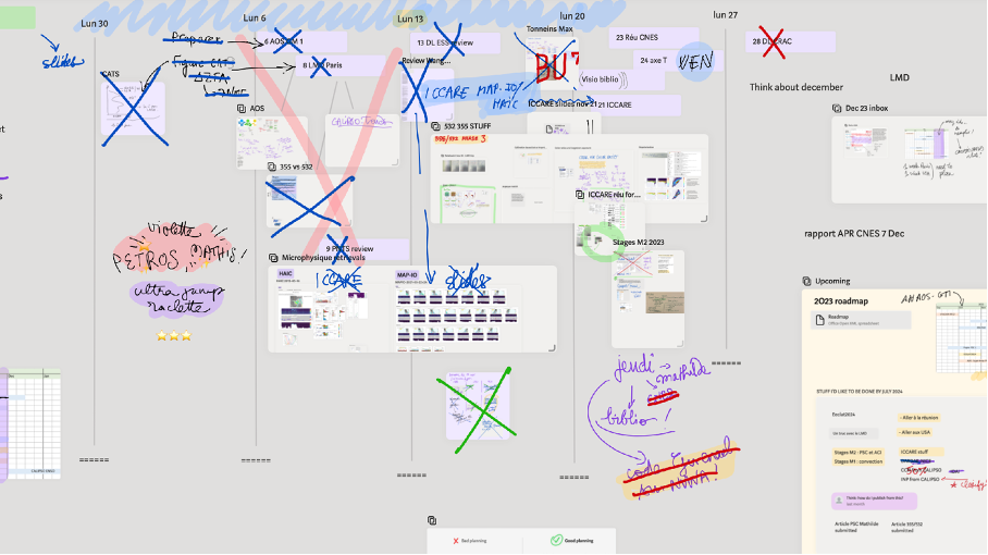
In many ways, Muse is like a paper notebook. In a notebook, you take rough notes. They don’t always look pretty. You might have some affection for them, because they are proof of your dedication, but you won’t be showing them around. It’s ok, because the value of the notes is not in the notes as a product, it is in what you’ll be using the notes for, in the insights they will reveal, the decisions they will lead to, the path of action they will enable. Muse is like that. It’s “just” a notebook — you won’t conceptually get out of it much more than what you’d get from a paper notebook — but it’s an enhanced notebook. It’s a notebook in which you can write and draw, but also paste images straight from your computer, as many as you want, and move them around, in pages that can expand a hundred times, a notebook in which a page can contain other pages, in which a page can appear at different places. A Muse board, when you look at it, as a fixed, frozen artifact, is not very different from a large piece of paper with images and text glued on. It doesn’t look professional. It’s not going to blow anyone’s socks off. But that’s not the point. Like a notebook, a Muse board is extra real estate for your mind. It’s optimized to be “just” that. It houses living, ongoing thoughts. Thoughts are not always pretty. Thoughts should lead to insights and action, and disappear. Muse provides infinite space for your thinking to happen, better than any other app I’ve found.
This post was entirely written in a Muse Board. Among other things, this allowed me to work on at least three parts of the text at once. Try to do that in Word. Now that the post is published, I’m going to trash the board.


You must be logged in to post a comment.